Strange, I suppose, to be writing a review of an exhibition just as it's closing, but I left my visit to the Ravilious exhibition at the Dulwich Picture Gallery pretty late. There is no real point therefore in me urging you to go, but I'm inclined to do so because this exhibition is an absolute stunner. All my hopes, all those anticipations, for it were amply met.
As I talked about obliquely in my first post about King's Lynn there is always a risk of disappointment when you see, or meet something or somebody, that has occupied such a special place in one's mental life, in one's imagination, for so long; and the work of Eric Ravilious (1903-1942) has occupied such a position for a long time ever since, as a teenager, when I came across an article about him in 'House and Gardens'. That was in the early/mid eighties, and I still have that article. This was however my first encounter with the real thing, and it was, at times, an emotional, even overwhelming, experience. That was partly due to the number of visitors, and the number of actual work on display. The four smallish galleries were crammed with both. But mainly it was the sight of these large and beautiful paintings themselves in all their subtle, muted intensity. Although there were examples of his wood-engravings and lithographs the exhibition overwhelmingly, and rightly, concentrated on his watercolours which were produced between c1930 and his death off the coast of Iceland twelve years later - twelve years of a quiet and growing mastery of technique. Learning from the 18th century British masters of watercolour such as Cotman, Ravilious produced work that is highly organised, thought through. There appears to be little of the spontaneity we associate with, say, the work of his contemporary John Piper. The influence here is of Paul Nash. However don't let that put you off from searching out Ravilious's work for yourself. His work is not strained, but it does have a haunted, slightly uneasy melancholic quality, which is partly down to his choice of subject. His method of working establishes a distance between the viewer and the subject. There is a delicacy and transience to them that I find hard to grasp let alone define
When I started this blog it was merely a way of publicizing my writing, particularly my novel 'Chameleon', however over time it has grown in directions I hadn't envisaged. One of the themes that has emerged is that of the everyday, the mundane and the over looked whether it is a street in a Suffolk village, a parish church, or the carved street signs in Bath. And it is that in Ravilious's work that both resonates with, and informs, my taste.
As I write these words I am reminded (perhaps oddly) of the architectural drawings of Charles Rennie Mackintosh I saw in the eponymous RIBA exhibition this summer; there is the same interest in light - at times it appears that Ravilious paints with light (I was upbraided at college for doing that. My tutor said I was too young (!) to do that. A curious and deflating, disabling statement. He had probably never seen a Ravilious) Both are drawn to the idea of the North; an idea we also find in the work of Ravilious's literary contemporaries W H Auden and J R R Tokien. It was Tolkien who, I think, came up with that haunting phrase: 'the Nameless North'. Perhaps, it can be argued, that the Picturesque (and Romantic) tradition in which both men stand is a rejection of the 'South'.
Like Mackintosh Ravilious too is essentially a linear artist in that he is inclined to think in line, rather than mass. The technical problem resulting from that thought pattern - how therefore to represent mass - he answers with the use of cross-hatching, analogous in technique to that of his wood engravings. This allows Ravilious the necessary illusion of the 3 dimensions, but also to build up rich colour and texture (where needed). On the whole, though, Ravilious's colours are muted, subdued. He also uses wax resist, and scratching out, to let in the light. A pencil is used not only to outline forms but to help describe shadow. (His pencil shading is actually quite loose.) In a sense Ravilious is a pattern maker, and he is both drawn to it as a subject (his love for the mundane and the domestic) and to its utility as a way of describing volume and mass whether it is the wallpaper of a farmhouse bedroom or the seat of a third class railway carriage. It is unsurprising therefore that Ravilious also designed things himself, including patterned papers.
Ravilious has been slowly gaining in popularity over recent years, and I'm tempted to say that in these politically uncertain days his art, which is perceived as very English (in its understatement) and nostalgic, answers a need in the viewing public. However I don't think that is the whole truth, or even some of it - I'm not somebody who believes in the 'zeitgeist'. The work of Ravilious talks to us in a quiet voice, using very often the mundane, the commonplace, the everyday, of things that are in fact quite profound. And I'm certain that his subject matter is a deliberate choice; his choice of subject is not immaterial as in, say, the work of Roger Fry. His work, including that produced as an official War Artist, is rooted in the everyday, the uneventful. The human figure is largely absent. And it is in that rootedness in the undramatic, the common experience of us; which in its particularity is related to the Romantic tradition of British Art and what he, perhaps, picked up from Paul Nash, who was his tutor briefly at the RCA, which also partly explains his current popularity. However, by painting them, and thereby changing them, Ravilious has endued them with a power that is emblematic and imaginal.
Monday 31 August 2015
Wednesday 19 August 2015
Wimpole Hall I
When we returned from Wales I spent a few days with the bf - one of our excursions was to Wimpole Hall. As the Cambridgeshire edition of 'The Buildings of England' points out it is the county's 'most spectacular' Country House. It is certainly the largest, though as Pevsner also points out the architecture is domestic in scale; the fireworks are on the inside. And it is those fireworks - a chapel by James Gibbs and James Thornhill, and rooms by Sir John Soane that were the reason for our visit.
Wimpole Hall sits on the southern slopes of the clay uplands that make up the majority of SW Cambridgeshire; to the south the house looks out over the wide, gentle valley of the Rhee to the chalk hills of Hertfordshire. (Hertfordshire, I think, has some of the most beautiful country in England.)
The hall is the focus of the remains of a vast and monumental Baroque layout of avenues - south, west and north - the work of Charles Bridgeman. The longest avenue stretches south from house for two miles to the old Roman road 'Ermine Street' - in the distance, half way down, is an octagonal pool that I can't believe didn't have a fountain in it. To the north, the avenue, which can never have been very long due to the hills rising in steps behind the house, was partly removed by Capability Brown to make one of his most successful, and beautiful Landscape Parks; the axial vista being closed by a folly, a sham ruined castle designed originally by Sanderson Miller and erected by James Essex of Cambridge, the architect and antiquarian. In the early 19th century Humphrey Repton, in keeping with the then Picturesque theory, began a process which has restored some of the original formality to the gardens immediately around the house.


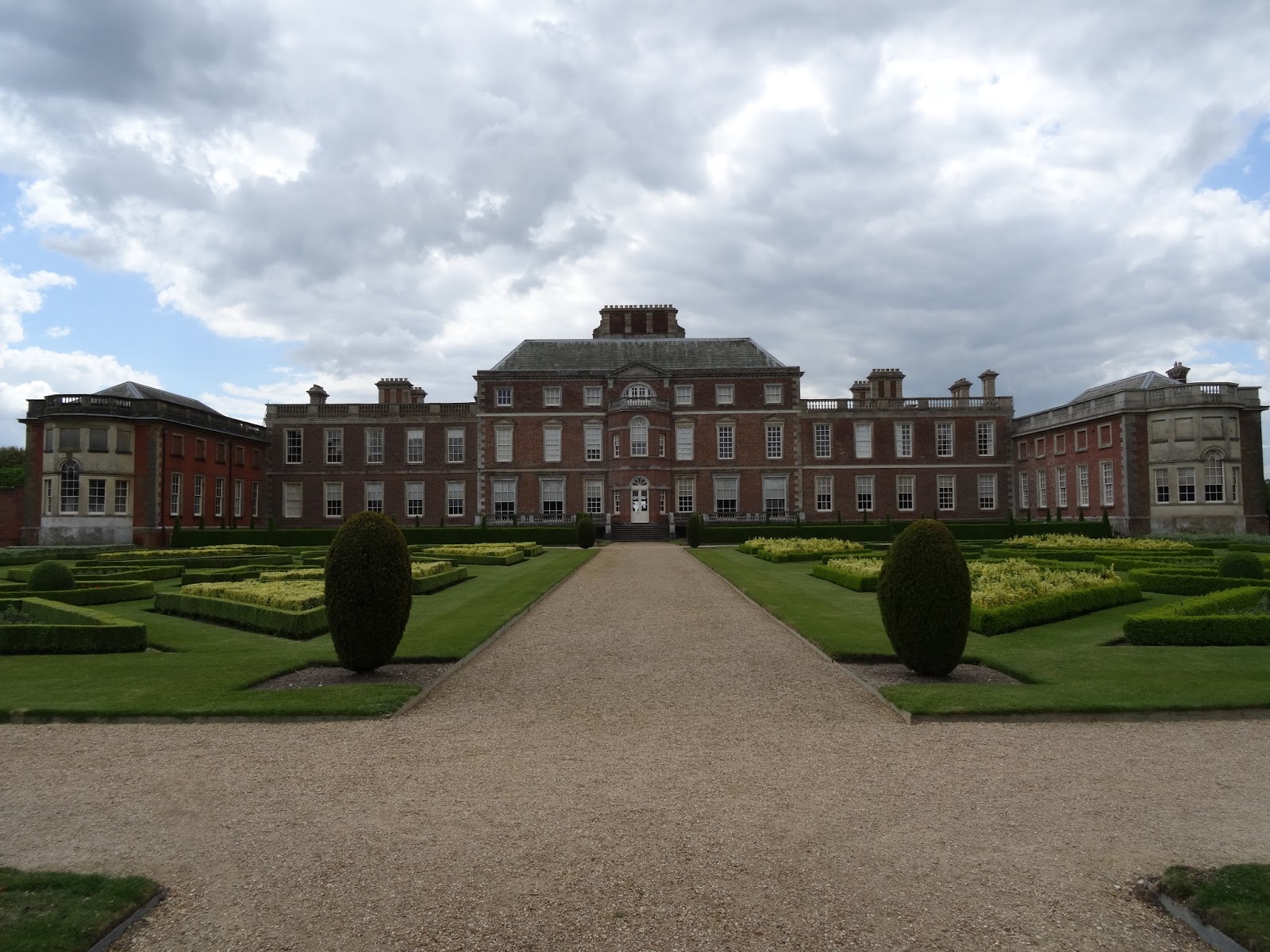
The building of the house has been a long and complicated story. It goes something like this: the original house, which forms the central 3 storey section, was started in the 1640s. It was a triple pile house of brick and stone. In the early years of the 1700s it was extended to the east and west in a sympathetic style by James Gibbs for the Tory politician Lord Harley partly to hold Lord Harley's vast collection of books and artifacts - his book collection alone consisted of over 50,000 items. Gibbs's library is on extreme right of the photograph. In the 1740s the Neo-Palladian architect Henry Flitcroft ('Burlington Harry') refaced the original part of the house, adding the three bay windows to the north front. Further additions, including a tower, were made in the nineteenth century by H E Kendall, but most of those, tower included, have been swept away with the exception, wisely, of the central chimney stack. It strikes quite the right visual note.
Thought (21.10.15): There's a similarity between the centre of the south front of Wimpole and the centre of the Gibbs Building, King's College, Cambridge. Wimpole is roughly twenty years after King's. Was Flitcroft influenced by James Gibbs? It would make sense if he had been.

To the east of the house, and the Neo-baroque stables by Kendall, is a model farm designed by Sir John Soane, 1794-5 (which was, for me, surprisingly vernacular); the octagonal dairy (inside like a Medieval English chapter house)and the adjoining farmhouse however are later, 1860 and 1862.


Wednesday 5 August 2015
Belton III: Ss Peter & Paul
'Built to the memory of God, and the glory of the Cust family.' So said Henry Cust. And with some justification. This small, rather pretty country church is crammed with monuments to the family, some the work of internationally important sculptors like Canova, Westmacot and Marochetti. So crammed as to be a distraction from the divine. And I suppose that's what makes churches in Britain, esp England and Wales such a delight to visit, the sudden discovery of something by somebody famous standing there amongst all the detritus of the parochial - stacks of chairs and notice boards and flower vases. A free art gallery in fact.
The church, which is reached from the house through a lovely set of wrought iron gates, has only one aisle (to the north), which has been extended out transept-like to provide more space for the monuments. There is another picture of the church, from the south, in the first Belton post. Of the monuments I was most interested in the Baroque, which are here (in order) by Edward Stanton & Christopher Horsnaile (x2) William Stanton and Henry Cheere. The final image shows amongst others the tomb by Marochetti and monument (standing woman) by Canova


The church, which is reached from the house through a lovely set of wrought iron gates, has only one aisle (to the north), which has been extended out transept-like to provide more space for the monuments. There is another picture of the church, from the south, in the first Belton post. Of the monuments I was most interested in the Baroque, which are here (in order) by Edward Stanton & Christopher Horsnaile (x2) William Stanton and Henry Cheere. The final image shows amongst others the tomb by Marochetti and monument (standing woman) by Canova


Works on Paper: Three Exhibitions at the Fitzilliam Museum, Cambridge
To Cambridge on Friday and three concurrent exhibitions at the Fitzwilliam Museum. (There is a fourth: 'Treasured Possessions' which the bf and I saw last month. Some wonderful objects but a little diffuse.) All three are about work on paper; watercolour and printmaking. And all three are outstanding exhibitions; the works on display all taken from the Museum's own rich collection of work.
The largest of the three, 'Watercolour: Elements of Nature' is a brisk exploration of the use of watercolour as a medium from the Renaissance (the most amazing miniatures) to the 20th century. (I did the exhibition in reverse, but the experience was none the worse for that.) Watercolour is often seen as the British medium, not surprisingly then the majority of work on display comes from these Isles. All the famous names are there: Turner, Girtin, De Wint, Cotman, Palmer. The last was represented by one work: 'The Magical Apple Tree' c 1830, a work of visionary intensity, shining out like an icon. An equally intense vision was offered to us by Ruskin who is represented here by four works. 'In the Pass of Killiekrankie' is a master work; incredibly small (I didn't realize how small) and worked in a way that seemed to link it with the Elizabethan miniatures that open the show. Superb. Not enough is made of Ruskin the artist. Poor chap only seems to be remembered these days for his sex life, or lack thereof.
Next to Ruskin's work Seargeant's three, sun drenched watercolours seem facile. The only real disappointment were the watercolours by Pissarro. They really were poor. A little disappointed too, if I'm honest, with the Paul Nash, as I admire deeply his oils and am drawn to his ideas.
Across the landing is the second watercolour exhibition: 'Ruskin's Turner's', that is the twenty-five Turner watercolours Ruskin bequeathed to Cambridge University to inspire the students. Lucky students, as this is another schatzkammer of good things. It is rare opportunity to see these works together as Ruskin, concerned about the conservation of these wonders, laid down strictures about their display. And wonders they are: small, vibrant and intense and altogether very beautiful.
Finally 'Designed to Impress; Highlights from the Print Collection' and like 'Watercolour: Elements of Nature' a lightning journey through the history of the print form the Renaissance to the present day. The work on display is of an equal quality to the other two exhibitions. There is work by Durer - the famous 'Melancholia I' - Rubens, Blake, Wadsworth and Munch among others. There seems to be an emphasis on the grotesque and the strange - though that is not a negative criticism. Something uncanny, even occult. The highlights however for me were a Rubens, and, surprisingly for I didn't know he was also an artist, a work by the Royalist champion Prince Rupert of the Rhine. A work of real quality.
It has been a week of Turners in fact. The bf and I were in Lincoln on Tuesday and we did a summary tour of the Usher Gallery where there are two exhibitions running: 'Lincolnshire's Great Exhibition' and 'Picture the Poet'. In addition to works by Lowry and Stubbs there is Turner's famous watercolour of Stamford. A second visit, I think, is required.
Sunday 2 August 2015
Belton House II: The Interior
The French influence continues inside with the plan: two public rooms in the central axis (Hall and Saloon), with three apartments of two to three rooms (withdrawing room, bedchamber and closet) on each floor with subsidiary service spaces. That, apparently, is very close to the French manner of planning a country house, like Le Vau's Vaux-le-Vicomte.
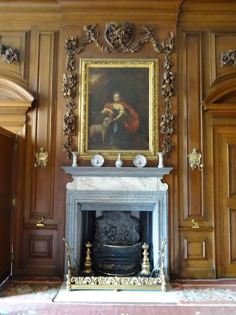
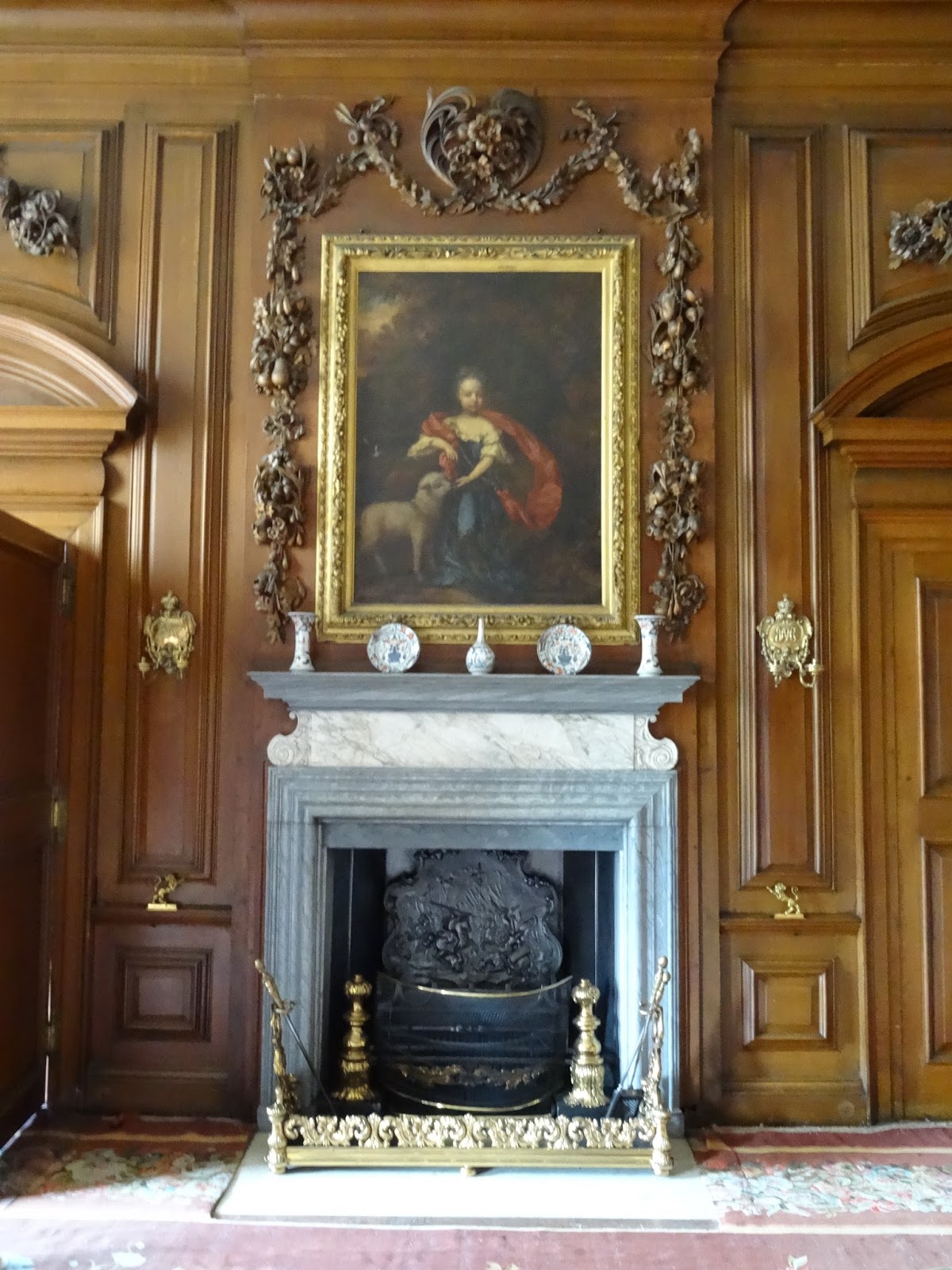
There is a touch of Baroque too to the original rooms with their luxuriant carvings by Edmund Carpenter and possibly Grinling Gibbons, just as there are little Baroque touches to the exterior: the curve of the door pediment crossing the string course on the garden (N) front, and the carving in the pediments. Nothing though to frighten the horses. The panelling is a throwback to the Tudor period. The greatest room in Belton is the chapel, but alas the blinds were down and it was just too dim to photograph, so I can't show you fantastic the Wren style reredos, which is of wood, painted to resemble marble. Looking back through the photos it's become apparent to me that as we go round houses like Belton I tend to photograph the most architectural thing in the room i.e. the fireplace. I've tried to keep the appearance of the fireplace to a minimum in the following images. The two Neo-classical rooms are by Wyatt, the first (1778) replacing the Great Dining Room, and the the second (1776) replacing one of the withdrawing rooms. The fireplace in the last picture is by Sir Edwin Lutyens and came from another house.


Subscribe to:
Posts (Atom)